 Graphical Panel Controls: Bargraph
 Graphical Panel Controls: Bargraph
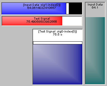
Bargraph controls display data using a using a simple horizontal or vertical indicator. The value of the associated signal is shown at the top of the control, while the bar graphically depicts the value by coloring in a portion of the bar between the set minimum and maximum values. A bargraph control can also be used as a slider control, which allows input by clicking and dragging the slider to a desired value. Examples of this type of control can be seen in Figure 1.

Table 1 lists the properties specific to a Bargraph control. A list of common properties for all controls can be found under Common Control Properties.
| Property | Function and Options |
|---|---|
| BarColor | Double-click to launch the Windows color selector to set the color of the control. |
| Style |
Sets the bargraph's orientation:
|
| IsSlider |
Specifies whether the control is a bargraph or slider:
|
| Set integer values |
Sets the input type when used as a slider:
|