 Graphical Panel Controls: Bitmap Button
Graphical Panel Controls: Bitmap Button
Graphical Panel Controls: Bitmap Button
Bitmap Button controls provide two options for displaying image content within a graphical panel:
Table 1 lists the properties specific to a Bitmap Button control. A list of common properties can be found under Common Control Properties.
| Property | Function and Options |
|---|---|
| Action | Dictates how the control functions:
|
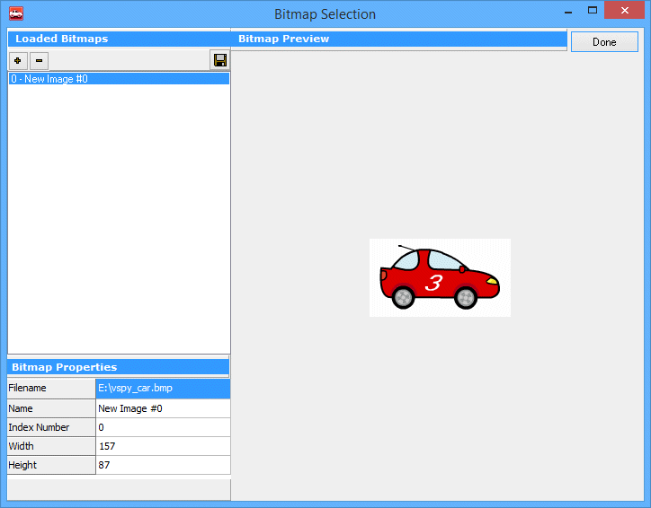
| Image |
Launches a special dialog box that allows you to select one or more images for this control;
an example of the interface can be found in Figure 2.
Use the + button to add an image to the control; after doing so, VSpy will show a preview of the image, along with its name, width, height, and Index Number. Press the - button to remove an image previously selected. |
| FirstPixelIsTransparent |
Enables or disables transparency within the button:
|
| DisplayOnly |
Allows the control to be set to an output-only mode:
|
| Stretch |
Specifies whether an image should be shown at its standard size, or stretched to fit the Bitmap
Button control:
|
 Spy Documentation - (C) Copyright 1997-2022 Intrepid Control Systems, Inc.